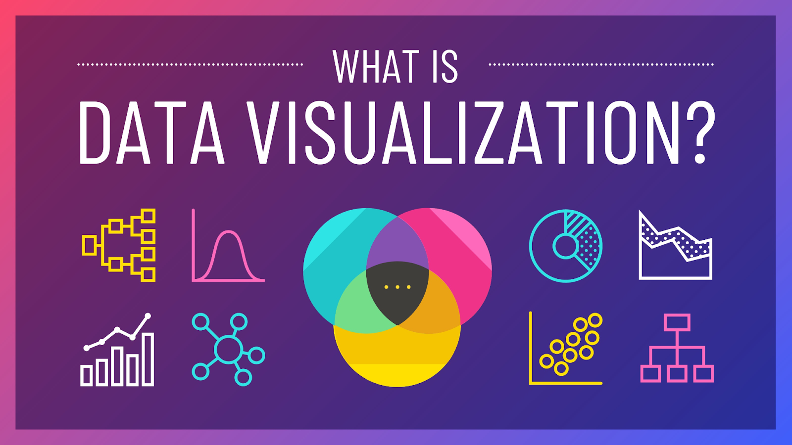
What You Need To Know About DATA VISUALIZATION
Data visualization is the process of creating visual representations of data in order to understand and communicate complex information effectively. It involves selecting the appropriate visual encodings, such as charts, graphs, maps, or diagrams, to represent the data in a way that is easy to comprehend and interpret.
Data and information visualization is an interdisciplinary field that deals with the graphic representation of data and information. It is a particularly efficient way of communicating when the data or information is numerous as for example a time series.
One of the main advantages of data visualization is that it allows us to see patterns, trends, and relationships in the data that might not be immediately apparent from raw numbers alone. It also helps to communicate complex ideas and findings to a wider audience, as visual representations are often more easily understood than raw data.
There are many tools and techniques available for creating data visualizations, including software programs like Tableau, Excel, and R, and libraries such as Matplotlib
and Seaborn choice of tool will depend on the specific needs of the project and the skill level of the person creating the visualization.
Effective data visualization requires careful consideration of the following elements:
1. The type of data being visualized: Different types of data, such as categorical, numerical, or temporal, require different visual encodings.
2. The purpose of the visualization: The goal of the visualization should guide the choice of visual encoding and design. For example, a visualization meant to compare values across categories might use a bar chart, while a visualization meant to show trends over time might use a line chart.
3. The audience: The visualization should be designed with the audience in mind, taking into account their level of understanding and the context in which they will be viewing the data.

There are many resources available for learning more about data visualization and improving your skills. Some popular books on the subject include “The Visual Display of Quantitative Information” by Edward Tufte and “Visualize This” by Nathan Yau. Online courses and tutorials, such as those offered by ONLEI Technologies is also a great way to learn about data visualization.
Conclusion:
Data visualization is a powerful tool for understanding and communicating complex data. By selecting the appropriate visual encodings and considering the purpose and audience, you can create effective and informative visualizations that help you and others understand and make sense of the data.
Important Links
- Python Course
- Machine Learning Course
- Data Science Course
- Digital Marketing Course
- Python Training in Noida
- ML Training in Noida
- DS Training in Noida
- Digital Marketing Training in Noida
- Winter Training
- DS Training in Bangalore
- DS Training in Hyderabad
- DS Training in Pune
- DS Training in Chandigarh/Mohali
- Python Training in Chandigarh/Mohali
- DS Certification Course
- DS Training in Lucknow
- Machine Learning Certification Course
- Data Science Training Institute in Noida
- Business Analyst Certification Course
- DS Training in USA
- Python Certification Course
- Digital Marketing Training in Bangalore
- Internship Training in Noida
- ONLEI Technologies India
- Python Certification
- ONLEI Group